Available on Asana Advanced, Enterprise, and Enterprise+ tiers, as well as legacy tiers Business and Legacy Enterprise.
Visit our pricing page for more information.
With reporting in Google Sheets, you can use project data to create custom reports and visualizations to see what’s on track and what needs attention. Google sheet exports are available for portfolios, projects and advanced search results. This article will help you get started and provide inspiration for creating reports.
Using Google Sheet reporting
Before opening a Google Sheet from your portfolio, ensure you have added the appropriate projects. We recommend consulting Google’s Help Center and Google Sheets Help Forum if you are new to Google sheets.
Getting started
- Install the Asana Exports add on in Google Drive using this link.
- Copy your Asana export link to sync with Google Sheets.
-
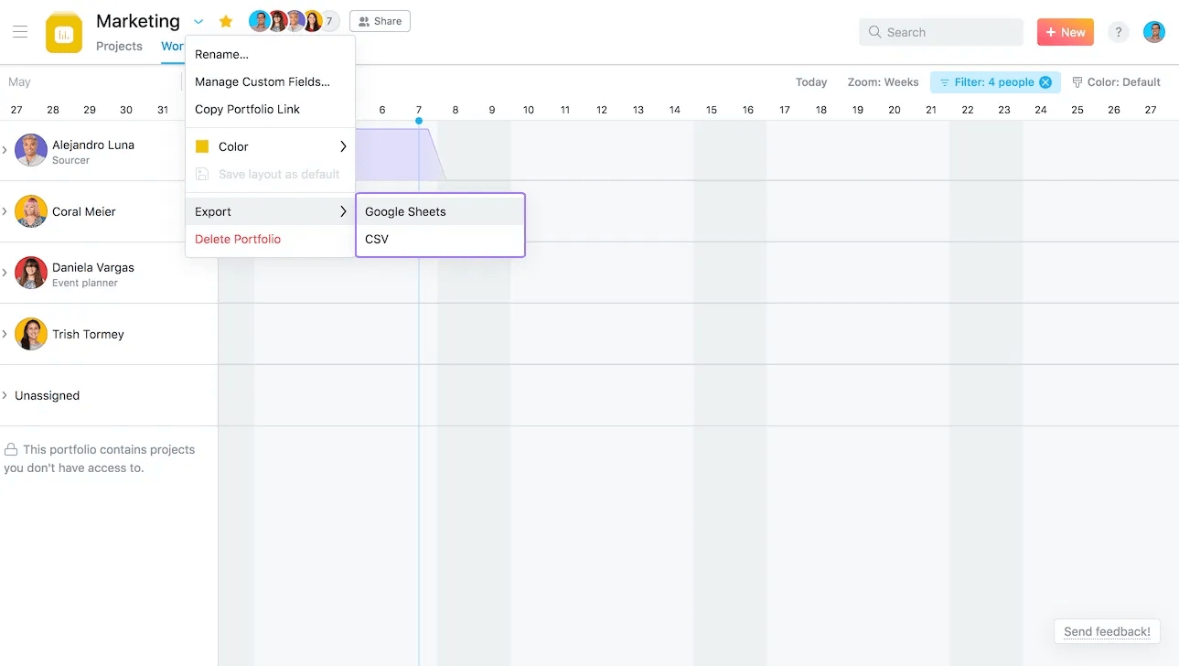
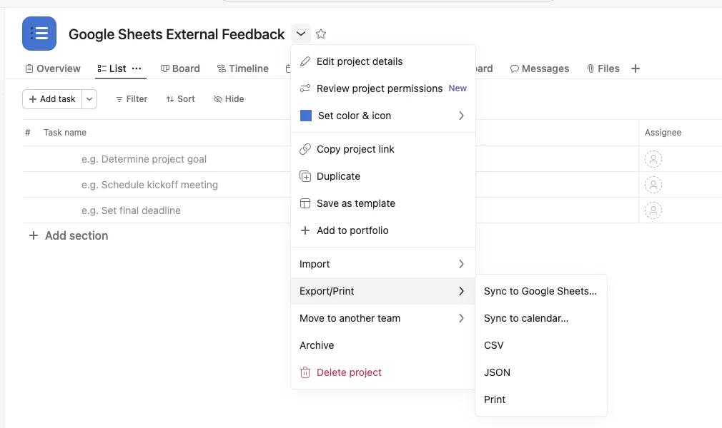
In Asana, click Export/Print from the drop down menu next to your project/portfolio header and select Sync to Google Sheets. Your Google Sheet will open in a new tab.
-
Copy the URL provided in the modal that follows.
3. Sync your Asana data to a new sheet
- Create a new, blank Google sheet
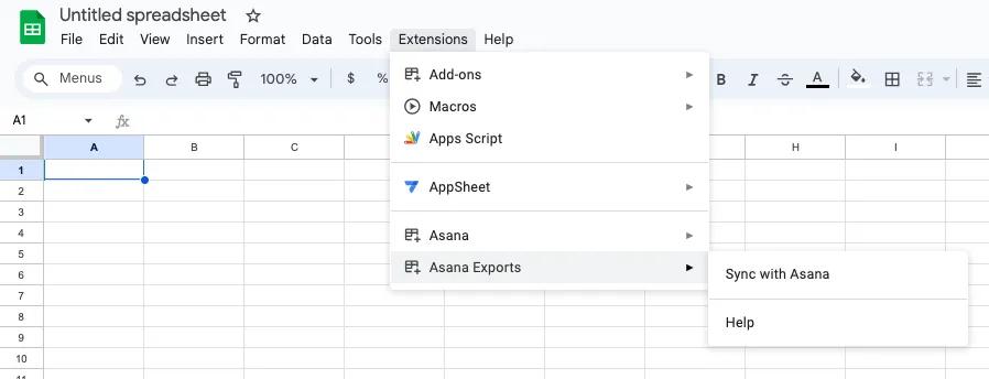
- Navigate to the Extensions tab > Asana Exports > Sync with Asana
- Paste the URL from step 2 into the input box and click Ok. Your sheet will be synced with your Asana data.
 Note
Note
The current limit for syncing and exporting data is 500 rows.
Portfolio reporting
First time users will need to authorize Asana to connect with their Google account.
Note
The data in your Google Sheet will automatically update every 6 hours.
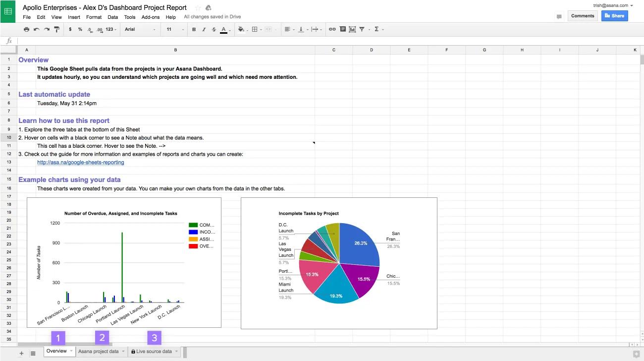
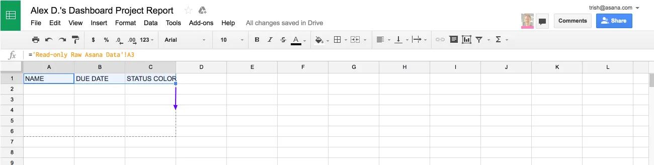
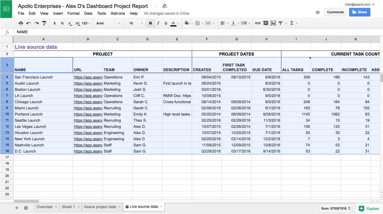
The Google Sheet report includes three tabs:
- Overview— a reference on how to use the Sheet with two example charts created from your data.
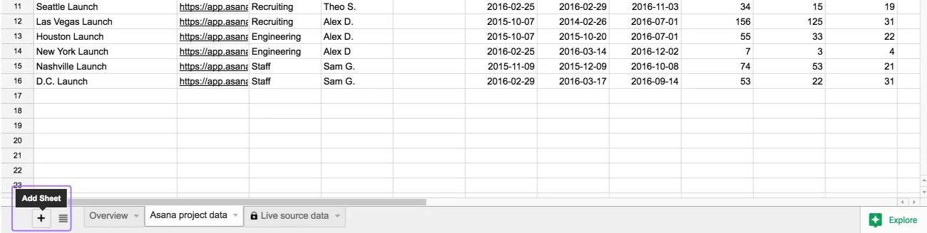
- Asana project data—shows the most important data from each project. Explore this data by sorting or filtering by the columns.
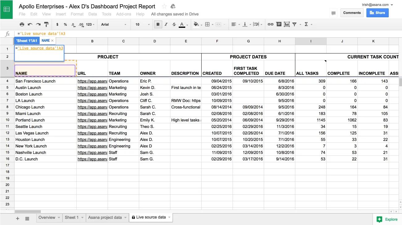
- Live source data—pulls live data directly from Asana. This tab is locked to protect the connection to Asana.
Note
Hover over column headers to learn more about the data in that column.
Building custom reports
Sample reports to create in your Google Sheet:
- Which projects are at risk and due soon? A scatter chart of due date and status color.
- Which project owners are pushing work forward quickly? A bar chart of recent tasks completed, by project owner.
- What portion of your projects are on track? A pie chart of status colors.
- Is work focused or spread across projects? A histogram of tasks completed in the past week in each project.
- Which teams have projects that are close to completion? A stacked bar chart of projects at % completion, by team.
Example: At risk projects that are due soon
This example shows how to build a report to find the individual projects that need your attention.
Create a new tab
-
- Click the + icon on the bottom left of your sheet to create a new tab.
- Choose a name for your report.
Add columns to your report by referencing the Live source data tab
- Select the top left cell of your new blank tab and type
=. - Navigate to the Live source data tab. Click the header of the column you want to copy. In this example, we will reference the Name column.
- Press
Enter. This will take you back to your report tab.
- Select the next cell to the right, and repeat steps 2 to 4 for the Due Date and Status Color columns.
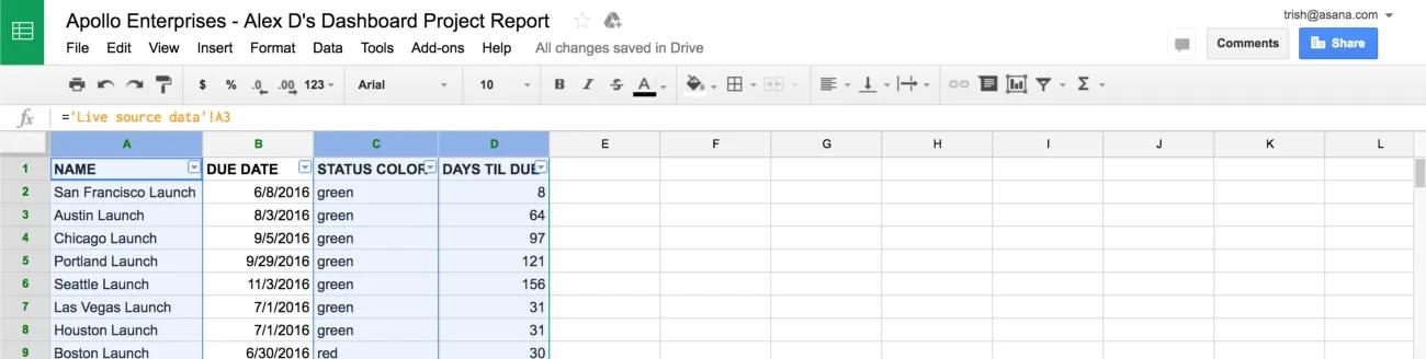
- Once the header cell of each column has been referenced, the data itself can be copied across. Select all three headers, and use the autofill handle on the bottom right corner of your selection to drag down.
Note
We’ve referenced the data in the Live source data tab, rather than just copying it. That means when the data in the Live source data tab automatically updates every hour, your report will also automatically update.
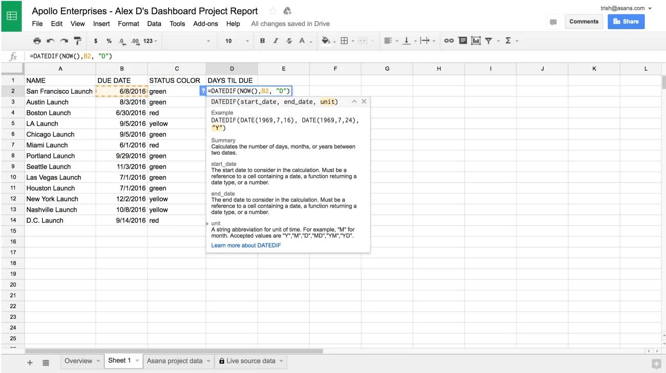
Use a formula to calculate the time remaining until the deadline for each project
- Type
DAYS TILL DUE as a header in the fourth column - Enter the formula
=DATEDIF(NOW(), B2, "D") underneath. This calculates the number of days between now and the value in the Due Date column.
- Drag the autofill handle to populate the rest of your new column.
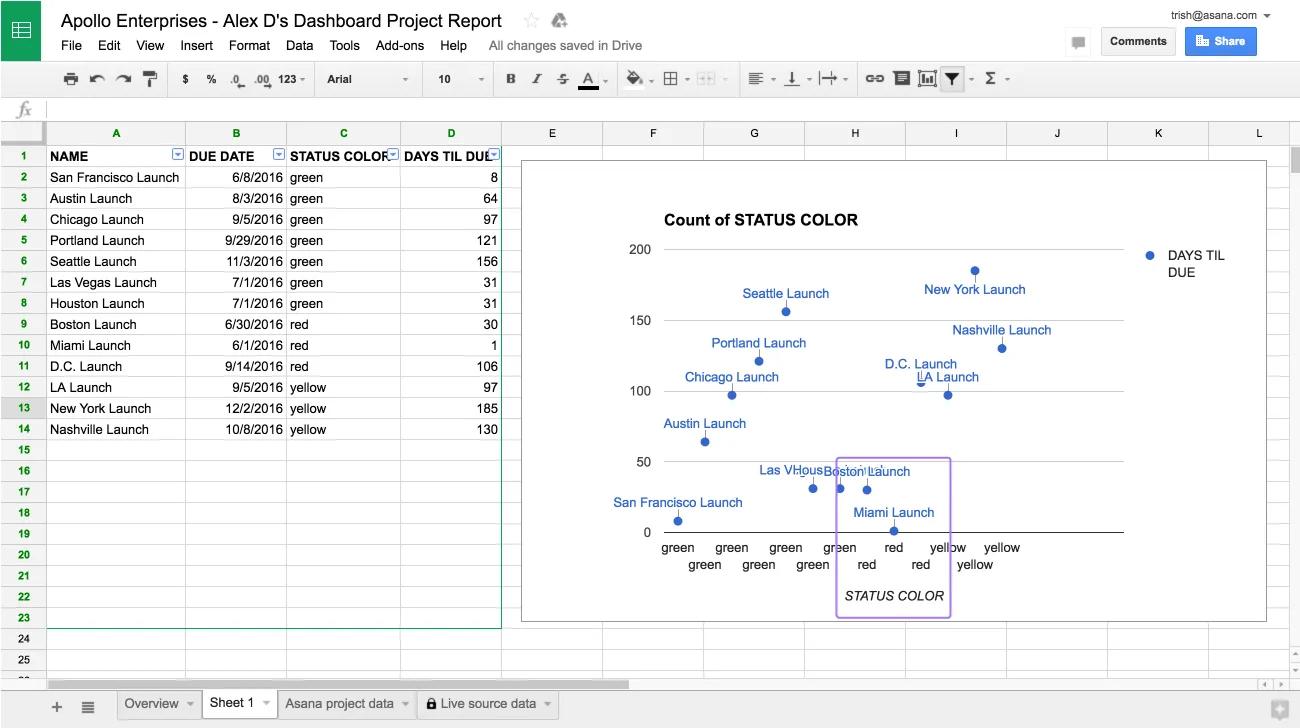
Create a scatter chart
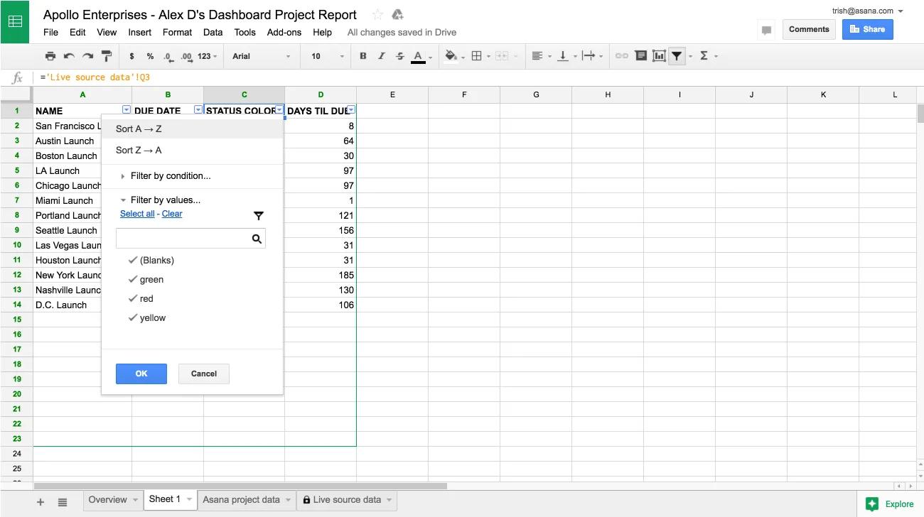
- Sort the report by Status Color by opening the Data menu and choosing Filter. Use the menu on the Status Color column header to Sort A → Z.
- Select the Status Color, Days Till Due, and Name columns, in that order, by holding
⌘ (on Mac) or CTRL (on PC) and clicking the letter above each column (C, D and A). These three columns are needed in the scatter chart, and the Name column must be chosen last as it will act as the label for each datapoint.
- Create a chart, by opening the Insert menu and choosing Chart.
- Choose a Scatter chart and uncheck Aggregate column C.
Use this chart to identify which projects are at risk. In the screenshot below “danger zone” projects are any projects that are red and due in less than 60 days. As the data is updated hourly, you can reference this chart frequently to understand where to focus team efforts.
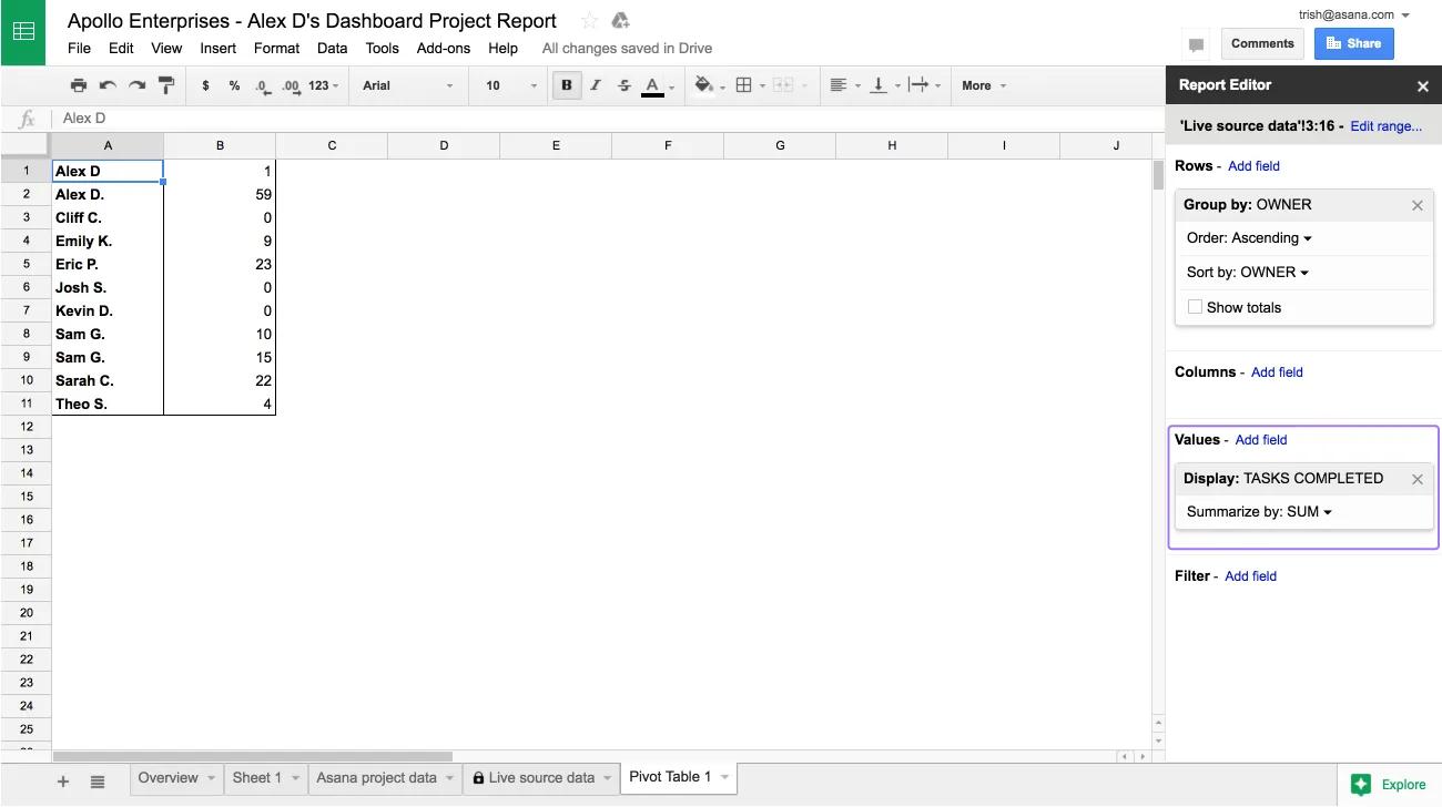
Example: Task completion rate by project owner
This example shows how to build a report where projects are grouped according to a property, in this case by project owner. Use this report to identify the number of tasks completed this week in projects driven by each project owner.
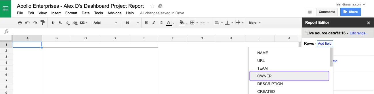
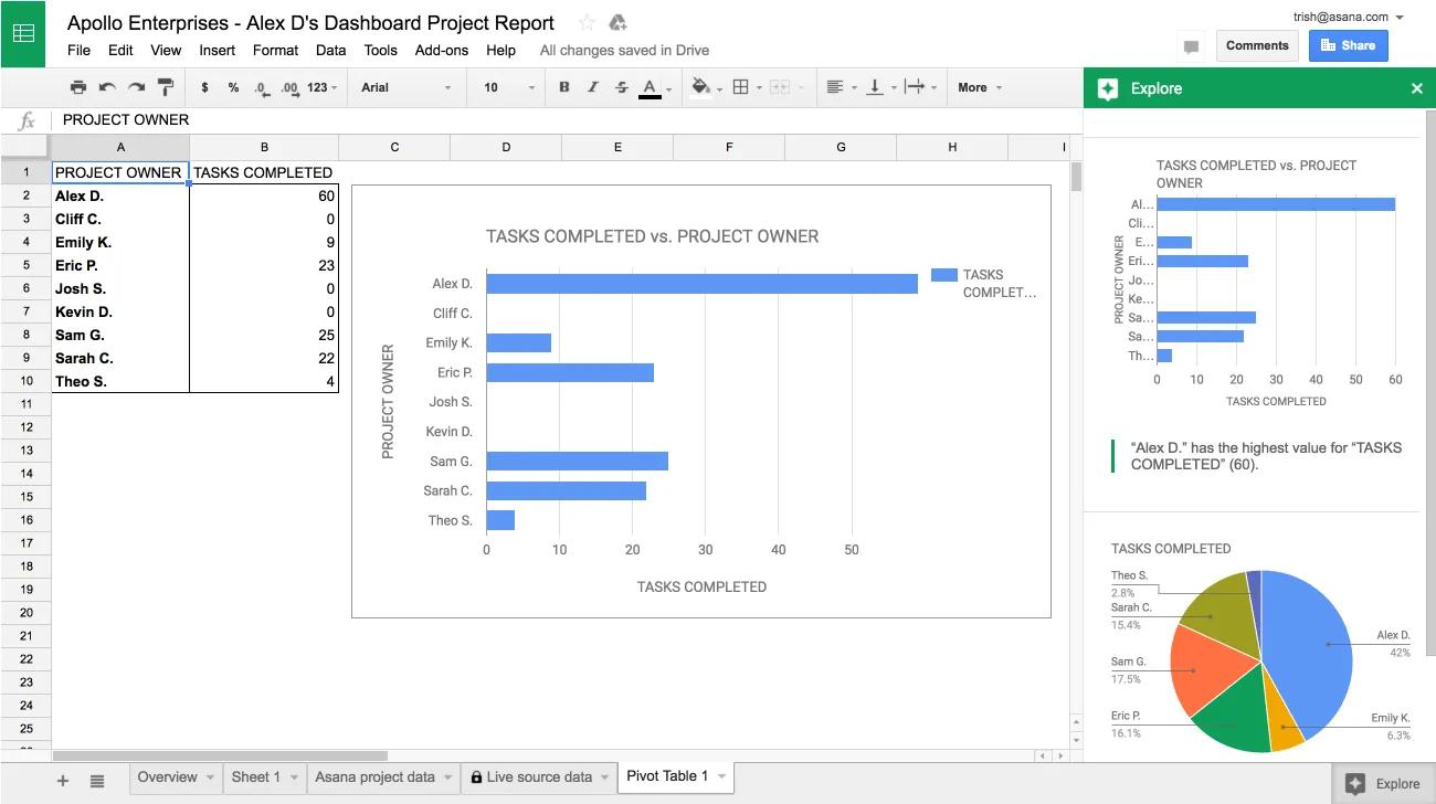
Create a pivot table to group the projects by owner
- Navigate to the Live source data tab.
- Select rows. Skip row 1 because a pivot table works best when the first row contains the headers.
- Open the Data menu and choose Pivot table. This will open a new tab titled Pivot table.
- From the Pivot table tab, in the Report Editor sidebar, under Rows, choose Add field. Select the column you wish to group your projects by, in this case Owner. Uncheck Show totals, this data is not needed in this example.
- Under Values, choose Add field. Select the column you’d like to understand for each group of projects—in this case, Tasks Completed.
- Check that the values for the group are summarized as needed. In this example, we want to see the total task completion rate for each group of projects, so we choose Sum.
Visualize the data
Use the Explore sidebar in Google Sheets, which generates relevant charts using artificial intelligence.
- Click Explore in the bottom right hand of the Sheet. In this example, a bar chart is a useful visualization of the task completion rate.
- To see a larger version of the chart, you can drag it into the main area of the sheet. Right click the chart to customize it.
Reports you create are saved automatically, and will appear the next time you open the sheet from Asana.
Note