Products
AI Platform
Asana Foundations
Company Type
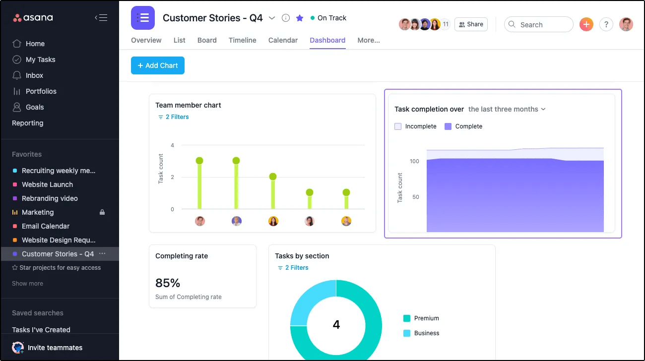
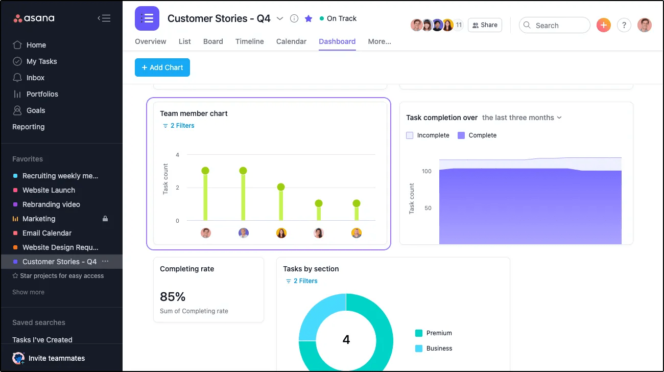
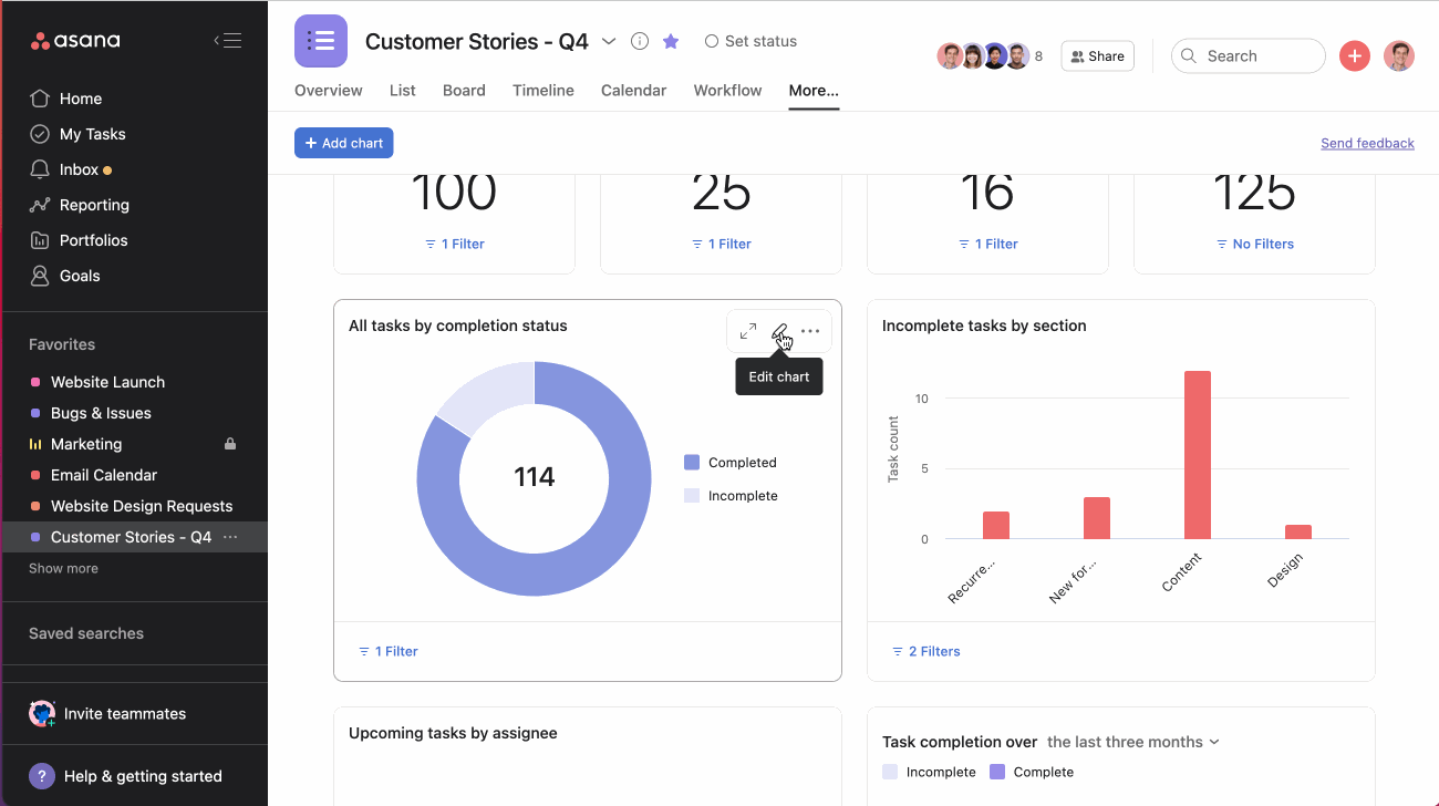
Charts provide a graphic overview of data associated with tasks, projects, portfolios, and goals. You can have up to 20 charts on a single dashboard.
To add a chart to a dashboard, click Add chart.
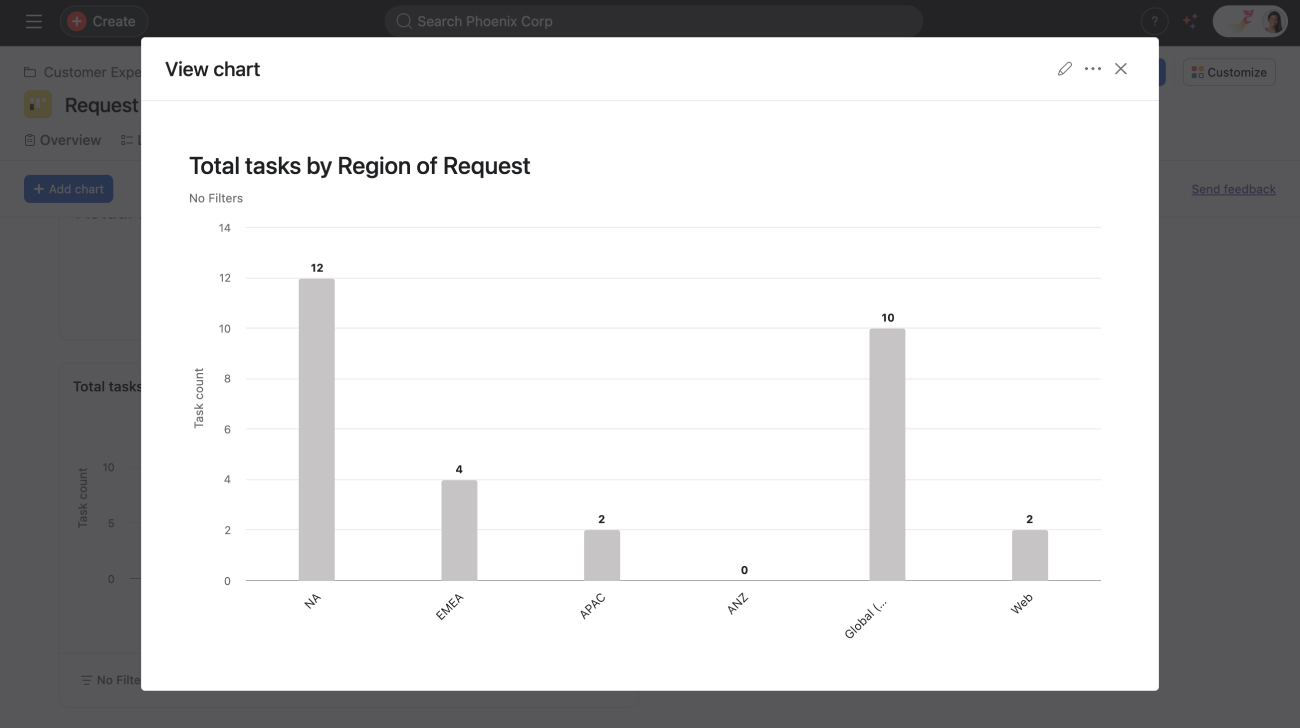
Customize a simple bar chart by adding filters, or choosing different fields for the X- and Y-axes.
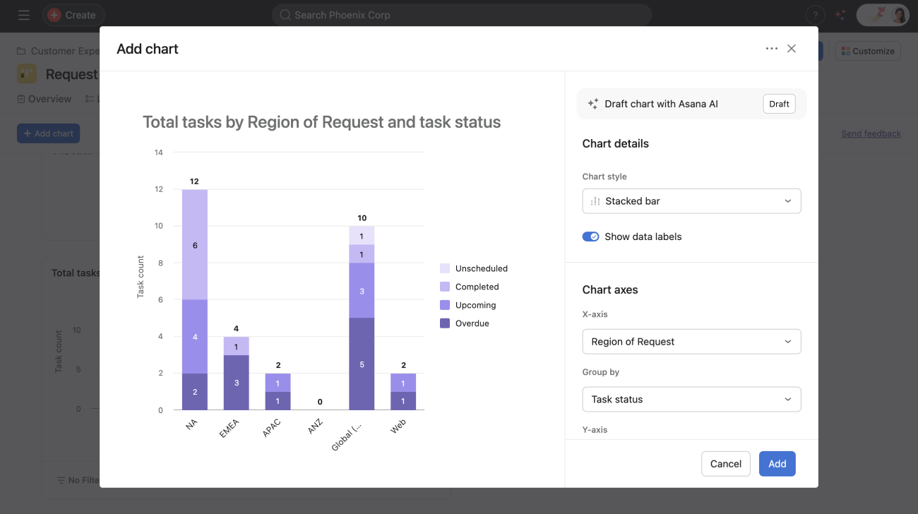
Gain an understanding of both the quantity and status of tasks at once with a stacked bar chart. Stacked bar charts allow you to compare totals and the categories that contribute to them over time or across groups. Each bar shows a total value, divided into segments representing individual categories, making it easy for you to see both the full picture and the specific contributions of each part.
Example: Total tasks by region of request and task status
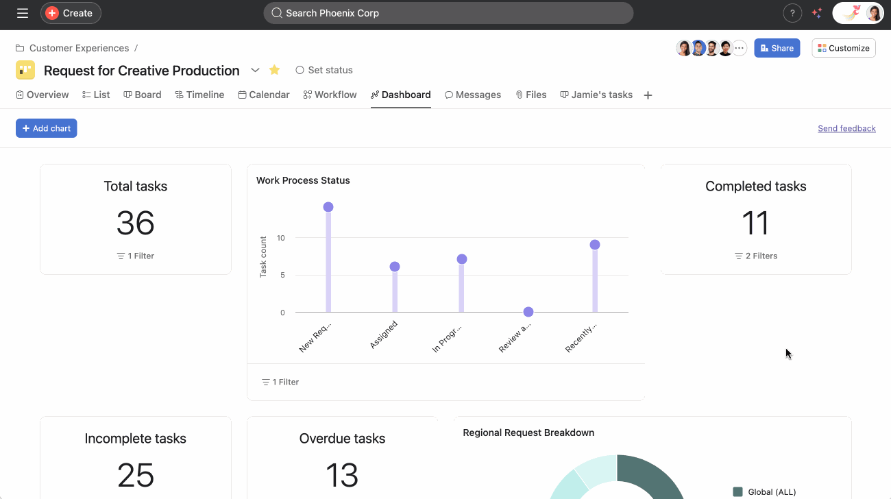
Use grouped bar charts to visualize and compare a primary field grouped by a secondary field along a single Y-axis metric. This allows you to easily break data into groups and compare key data points over a metric.
To create a grouped bar chart:
The resulting grouped bar chart will display your primary field grouped by your secondary field, enabling you to compare the Y-axis metric across groups at a glance.
Line charts help you illustrate trends over time and understand which processes are more effective within your team.
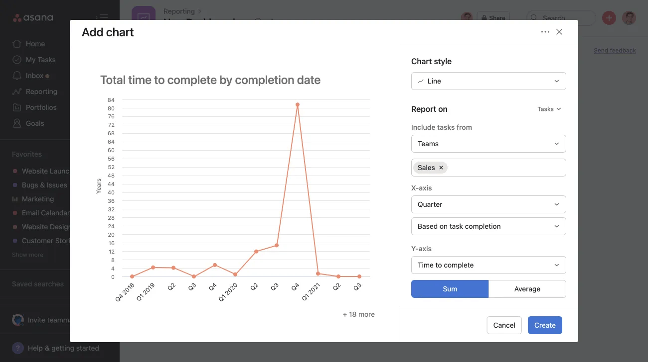
You can use manual benchmark lines, allowing you to add a user-defined reference line directly within your line charts. This provides a clear visual way to compare actual performance against targets, thresholds, or goals. Whether you're tracking project budgets, team velocity, or campaign metrics, benchmark lines help you contextualize your data at a glance and make more informed decisions about your work.
This chart helps you track your team’s velocity over time and how quickly your team is completing work.
Example: Task completion over an amount of time.
Available on Asana Starter, Advanced, Enterprise, and Enterprise+ tiers, as well as legacy tiers Premium, Business, and Legacy Enterprise.
Burndown charts are a visual representation of work left to do versus time. They help teams track progress, predict completion dates, and identify potential delays in projects. Burndown charts provide a clear overview of project status, enabling teams to make data-driven decisions and adjust their strategies as needed.
Burndown charts in Asana provide a graphical representation of work remaining over time. The chart displays two key elements:
When you click on the chart while the tooltip is visible, it will take you to the Advanced Search for that specific area. This makes it easier to follow up on any tasks that are still pending.
The chart automatically updates as tasks are completed, providing real-time insights into project progress.
Note
Ensure all tasks in your project have accurate due dates and completion statuses for the most precise burndown data. For large projects, consider breaking down work into smaller, manageable chunks to get more granular burndown data.
You can sync data from Jira Issues into Asana projects and create burndown charts from synced data from Jira Cloud. For example, you can sync story points from Jira Cloud, and build a burndown chart with story points in Asana.
Donut charts cannot use averages as their measure, as they are designed to show the proportions or percentages of a whole. Each data point in a donut chart represents a part of the total, and the chart is divided into segments to illustrate these parts. Since averages represent a central tendency or an arithmetic mean, they don't inherently represent parts of a whole.
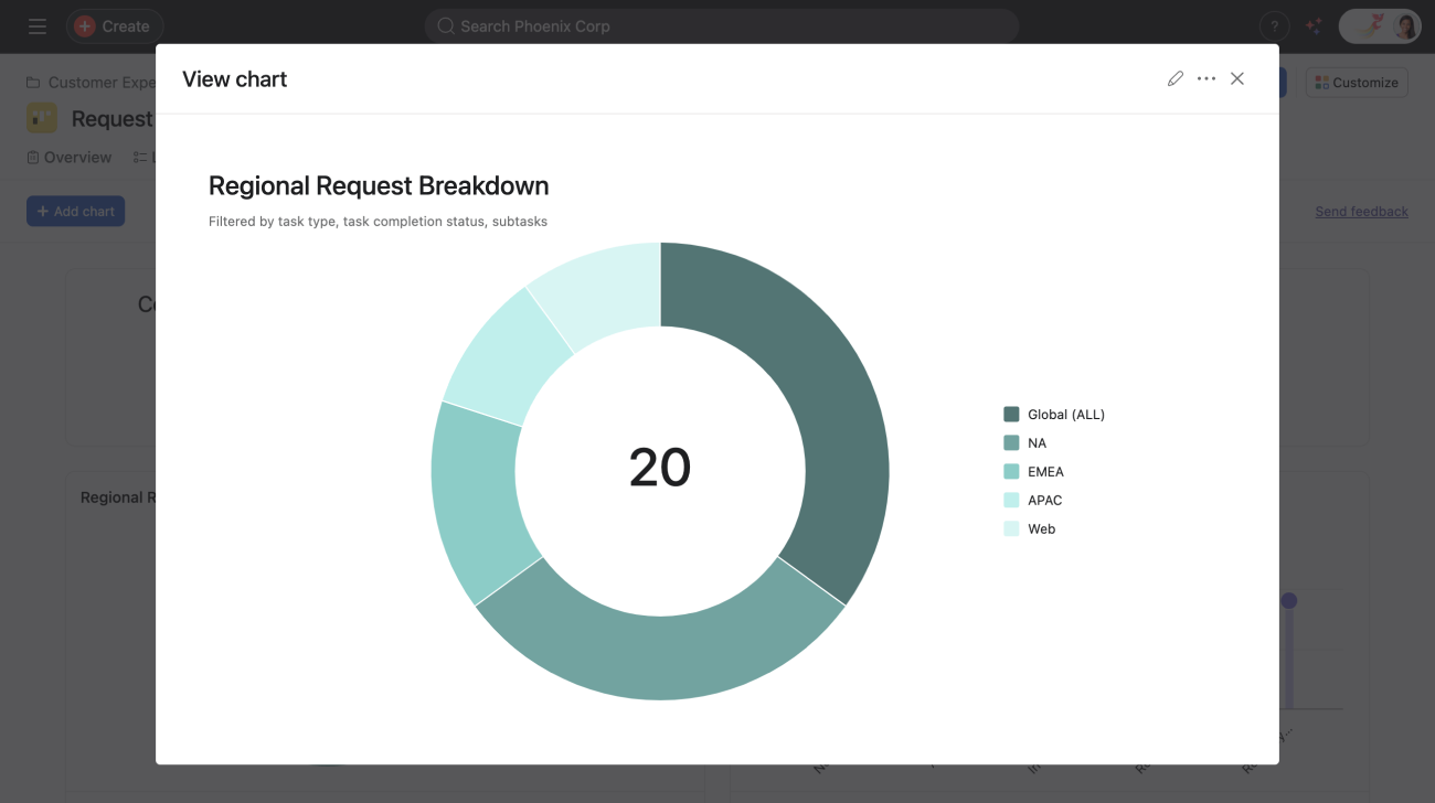
If a task is multi-homed across multiple projects and a chart is then grouped by project, the task will be counted separately for each associated project. This means the task will be double-counted, as it will contribute to the count of each project it belongs to.
The task count shown in a donut chart (the number in the middle) will include these duplicate tasks, as multi-homed tasks will be accounted for more than once in this number.
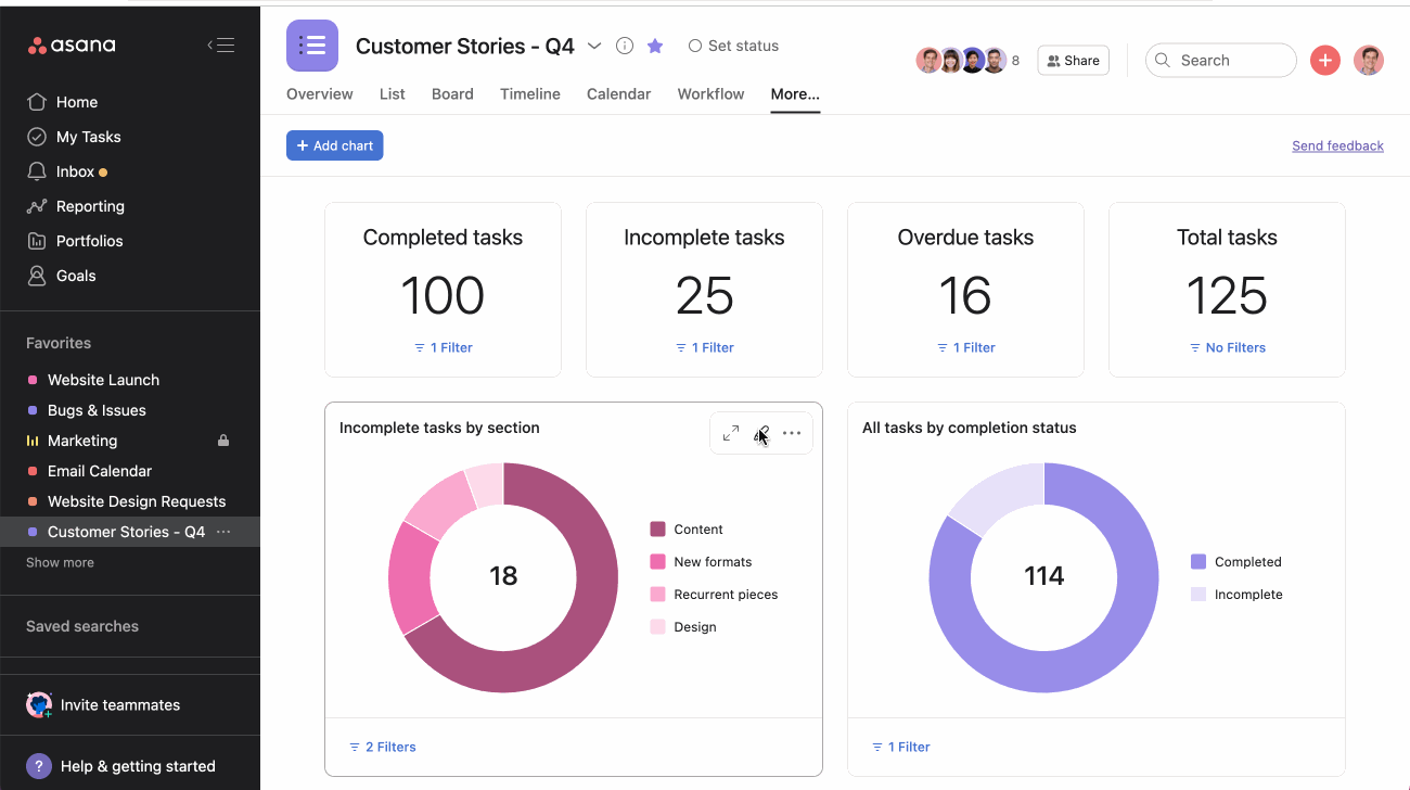
With donut charts you can:
Get a quick pulse on how big each of your work slices is. For example, are your incomplete tasks a tiny or large piece of the pie?
Visually represent tasks by completion status or tasks by section custom field by swapping out one for the other or clicking the Pencil icon to customize your chart.
You can add a number field to your project to see its value in this chart.
Enhance your data report with a sum total of your existing numeric custom fields in a particular project. Whatever your individual custom fields are, they will populate the chart to create a roll-up summary.
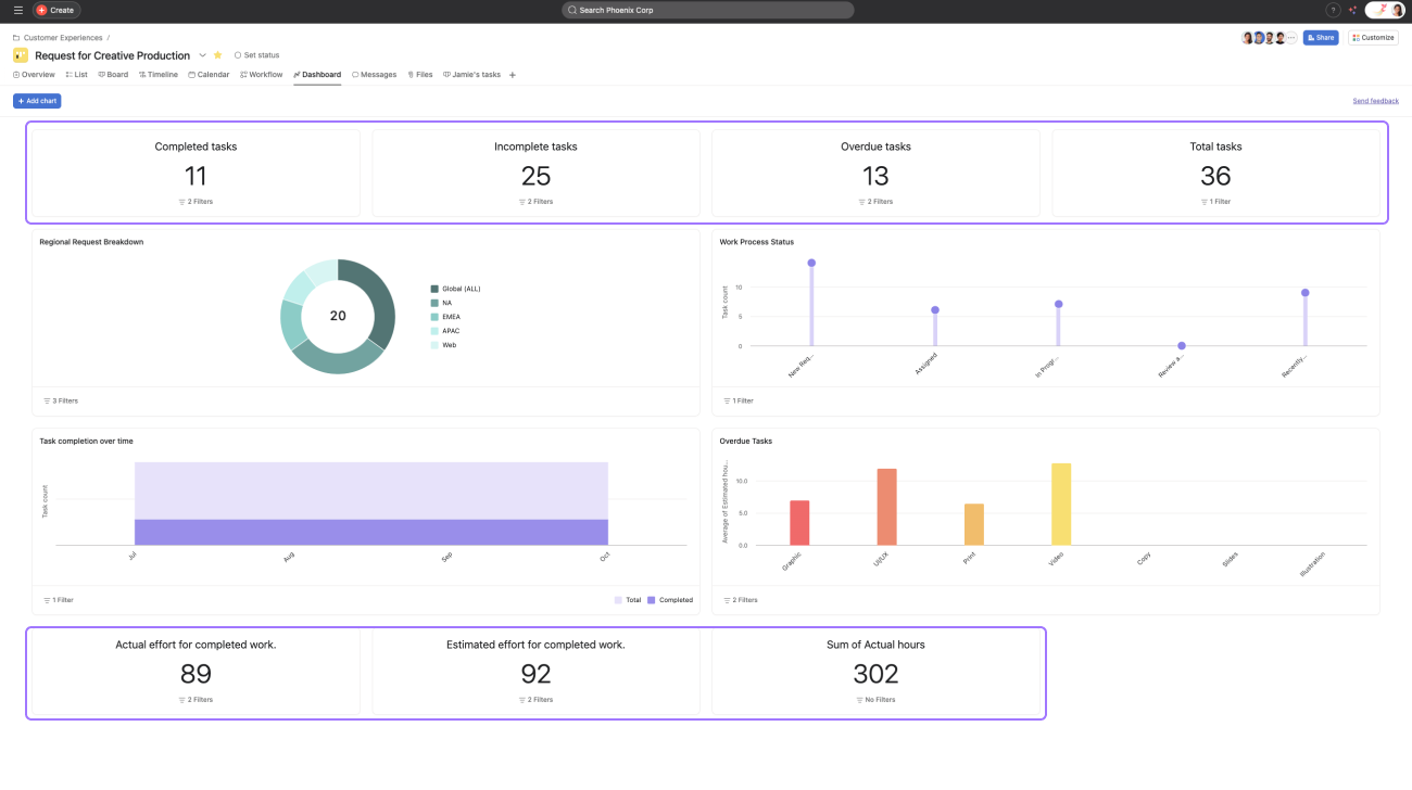
We recommend using this chart when comparing estimates to actuals, such as budget to actual costs, or if you want to quickly sum up the hours your team has spent on the project.
If you have numeric custom fields, we will automatically pull those onto the dashboard.
Example: Task count by assignee.
You can:
Understand how work is distributed across your team. At a quick glance, you can gauge who is performing and who might be overloaded.
Click the Pencil icon to customize your chart.
If you hover over the assignee lollipop, you can see how many tasks they have upcoming.
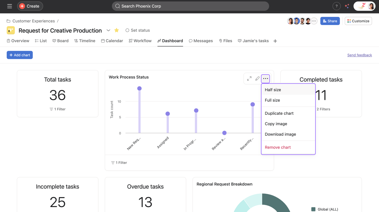
To edit your chart, click on the Pencil icon next to the selected chart.
From the next window, you can customize your chart to your specifications. Once you’ve finished making your edits, click Save.
You can reorder the layout of your charts by dragging and dropping them.

Click the expand icon to display more data and view your chart in a larger format.
You can also click the three dot icon and choose to resize your chart to a half or full size view.
You can export each one of the charts to an image (png) individually. You cannot export the whole dashboard as one.
In addition to exporting charts as images, you can copy charts directly to your clipboard. This allows you to quickly paste charts into external documents such as PowerPoint presentations or Google Docs, streamlining the process of sharing insights outside of Asana.
If you want to add charts to your status update, download the chart and simply add it as an attachment in the status builder. You can then drag it into an email, a Slack message, or a presentation slide to report on team progress.
Color customizing charts and graphs can help you instantly identify and differentiate any potential road blockers for your team at a glance. Applying a unique color to different charts helps to visually represent tasks by completion status or tasks by section custom fields. Custom colors can be pulled in for both filtered and grouped charts.
Multi-metric charts allow you to add multiple numeric and time metrics on the same chart to compare different performance measurements. Multi-metric charts enhance your reporting capabilities by allowing you to add up to four different metrics on a single chart.
This functionality is available in line charts, bar charts, and lollipop charts used in Universal reporting, portfolio dashboards, and project dashboards.
How to add multiple metrics to a chart:
Each metric will be displayed in a different color on the chart, making it easy to distinguish between them. You can hover over data points to see specific values for each metric.
Multi-metric charts are particularly useful for:
Stacked bar charts combine groups into single stacked bars for each primary field value. Grouped bar charts display groups as separate adjacent bars for easier comparison.
Yes, currently only four groups are shown.