Products
AI Platform
Asana Foundations
Company Type
Visit our pricing page for more information.
Available on Asana Starter, Advanced, Enterprise, and Enterprise+ tiers, as well as legacy tiers Premium, Business, and Legacy Enterprise.
Visit our pricing page for more information.
Note
The time period filter is only available to Advanced customers, and those on the legacy Business plan and above.
Dashboards are tabs containing charts and visualizations that let you zoom out from the day to day to quickly understand your team’s progress. These charts help to instantly identify potential blockers in your team’s work and move the project forward.
The Dashboard tab is a good reference point for finding data to get a quick pulse on the progress of the project.
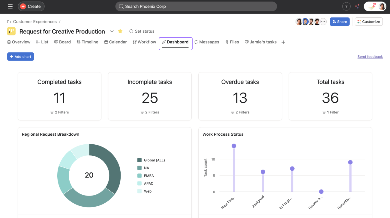
To access, click the Dashboard tab from your project.
The charts in dashboards will auto-populate when you first land on the tab. You can also add customized charts and numeric roll-ups. Dashboards will automatically update every time you visit the tab or refresh the page, so you know the information is always up to date.
To add a chart to your project dashboard, click +Add chart.
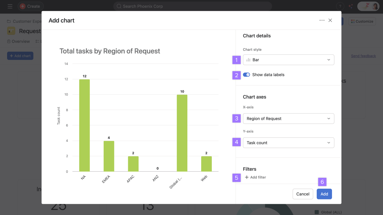
From here:
Choose your chart style
Toggle on or off data labels
Choose your X-axis
Choose your Y-axis
Add filters
Click Add
Learn more about the chart styles you can choose from.
You can also add text widgets to your Asana dashboards. Adding custom text content directly to your dashboard helps provide context, share additional information, and organize dashboard content more effectively.
Dashboards display key performance indicators relating to specific projects. It can display metrics for a project's overall performance and progress or highlight particular problems that require further attention.
Offering visual data in your reports makes it easier for your audience to quickly grasp the information presented and then consider the outcomes from that data.
Use these features to :
By using these charts to report, you are :
Like what you see? Get started with a free Asana trial today. Try for free
Want to learn more? Check out all the features of Asana Reporting Dashboards.